React is one of the leading tools for building advanced and modern websites. According to the research from BuiltWith, over 53 million sites are based on React. It gains popularity because it creates fast and interactive interfaces, but as things become more complex, managing everything becomes challenging.
This is where strong structure and planning matter. Teams offering ReactJS development services often use a method called Atomic Design to stay on track. It effectively breaks down the website into smaller, manageable components that will be used to build the larger sections with ease.
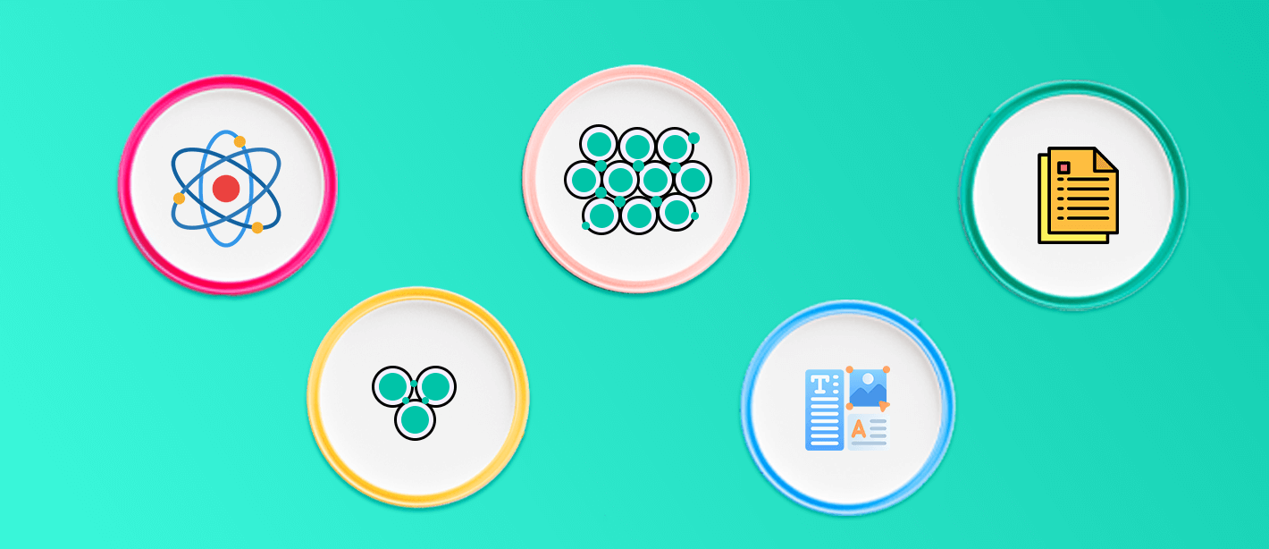
There are five important elements of atomic design: atoms, molecules, organisms, templates, and pages. Atoms are the basic pieces, like buttons or text fields. Molecules combine atoms into simple functions, like a labeled input. Organisms are full sections like headers where templates set the layout, and pages show real content.
This guide will walk you through how atomic design maps directly to ReactJS development services, along with implementation steps, examples, tools, and advanced insights.
What Is React Atomic Design?
The React atomic design makes the process of generating a website a simpler one. This method sees a website as a system of individual building parts instead of a single, complicated project with many pages. Users can make a better design by breaking them up into five separate layers.

Each level has a specific purpose. Together, they create a smooth path from the simplest elements to full, content-rich web pages.
1. Atoms
Atoms are the smallest part of a website; they cannot be broken further. These include buttons, icons, a color palette, and an input field. In React, an atom can be a single component with properties like on click” or “label”. After making these buttons, you may use them on all of the sites. This makes sure that items with the same function look and act the same on every page.
2. Molecules
Atoms come together to do a small, clear job, which is what molecules are. One way to make a search bar is to join an input field (atom) with a button (atom). Here's another example: a labeled form area that has both a label and an input box.
Molecules are simple, but they start to have real meaning in how a site works. In React, these are reusable units that can appear in several parts of the app while performing the same job.
3. Organisms
Organisms are bigger, more complex parts of a page. They assembled the clusters of atoms and molecules to create a meaningful section.
For example, an organism could be a website header. It could have a logo (atom), navigation links (molecule), and a search bar (molecule). These parts are often the same on numerous pages and help the website have a clear structure.
In React projects, organisms are large, reusable UI sections that help developers maintain a clean, organized structure.
4. Templates
Templates establish the structural organization of elements on a page. Currently, they do not utilize actual content; rather, they demonstrate the intended placement of elements. Templates facilitate the maintenance of consistency throughout the site and streamline the process of creating new pages without the need to begin from the ground up.
An online store typically utilizes a product detail template that consistently features a header at the top, product information in the central section, and a footer at the bottom.
In React, templates frequently serve as layout components that provide developers with a pre-defined structure to populate subsequently.
5. Pages
Pages are where everything finally comes together. A page is based on a template but has genuine information and content.
A product page, for instance, might utilize the product template but have authentic pictures, prices, and descriptions of the goods. A homepage could have its own template with banners, featured products, and deals.
Pages are the last layer in React where the design system connects to real data and logic to make the finished product that customers see and use.
Why Atomic Design Matters
The atomic design patterns significantly enhance the consistency of the project and also help the professional to manage the project effectively. Developer save their valuable time by using modular components instead of building from scratch. When collaborating with a ReactJS development company, this approach guarantees that websites are designed in a structured, flexible, and scalable way, while remaining clean and easy to manage.
Why Some Developers Use Atomic Design in React Projects
Ø Consistency Across the UI
Have you ever used a site where buttons change shape or color depending on the page? That happens when different developers build things their own way without a shared system.
Now imagine this:
- You build one button style.
- You call it Button.
- Then you use it everywhere in forms and on cards.
You don’t need to copy and paste it again and again; that's the core idea behind Atomic Design. It helps developers to stay consistent throughout the project.
Ø Reusable Components
When a developer starts a project, it typically has only a few pages at first, making it easy for them to handle. However, as the project progresses, you will find that there are more than 40 pages, each with its own layout, which makes things more complicated.
The atomic design methodology breaks down into smaller components to address this challenge. This approach allows one to construct pages not from the ground up, but by assembling pre-existing, functional elements.
Ø Scalable by Design
It is essential to maintain the scalability of a React application's architecture as it grows. Atomic Design establishes a hierarchy that simplifies scaling by separating basic components (atoms) from more complex structures (organisms and templates) that form the overall layout.
Rather than starting from scratch, developers can create new views by combining existing elements. This approach not only eases the onboarding process for new team members but also reduces their workload. For instance, using a product grid on an e-commerce site might only require implementing a ProductCard organism again within a GridTemplate. This enhances delivery speed and reduces technical debt.
Ø Alignment Between Design and Development Teams
Many front-end developers often encounter significant challenges due to the gap between design mockups and implementation. Designers focus on images for user engagement, while engineers focus on the structure and logic behind them.
The atomic design effectively bridges the communication gap by creating a common vocabulary for design elements. By using the standard terms such as atoms, molecules, organisms, etc, it fosters a good relationship between designer and developer. When a designer requests a change in the molecule, the engineering team automatically locates and updates the relevant code, reducing the need for clarification and a lengthy process.
Ø Simplified Testing
Component granularity significantly improves readability and reusability. The atomic design focuses on isolating logic and thus makes the testing process simple. When an atom, such as a text input or dropdown, is tested for reliability, all parent components using it gain that confidence.
Furthermore, updating basic components like modifying the button function, automatically flowing through the component tree, reducing the manual efforts, and avoiding testing duplication. This approach results in cleaner, more stable codebases with fewer regressions over time.
Mapping Atomic Design to React Architecture
ü Folder & Module Structure for Scalable UI
A well-structured UI component hierarchy is essential for team alignment and long-term scalability. In a React-based atomic design system, structure is more than a matter of preference; it becomes the foundation for collaboration and reusability.
Here’s how to organize your project folders to reflect the atomic design pattern:
Basic ReactJS project structure:
This structure clearly reflects atomic design tiers, improving navigation, scalability, and consistency. Developers and designers alike benefit from predictable locations and naming patterns.
In monorepos or shared UI libraries:
This setup is ideal for teams managing multiple apps or platforms. Keeping a shared UI system in a package allows code reuse and visual consistency across projects, crucial for any ReactJS development company.
ü Building Atoms in React
Atoms should be simple, focused, and styled using your system’s design tokens. A good example is a customizable button component:
Best practices:
- Use design tokens: Implement design tokens for colors, consistent spacing, and topography throughout the project.
- Avoid project-specific styles: Create reusable components by avoiding project-specific styles, allowing atoms to integrate into any context seamlessly.
- Support themes: It enhances the user experience by adding flexible theme support, using context or props to switch between dark and light modes effortlessly.
- Naming conventions: Choose atomic-centric names like Button, TextField, and Icon to foster clarity and maintainability in your design system.
Ø Composing Molecules & Organisms
Molecules are composed of atoms, while organisms are composed of both atoms and molecules. These groupings introduce logic and layout while preserving reusability.
Example molecule – SearchBar:
Example organism – Header:
Development guidelines:
- Avoid prop-drilling: Use context to share state efficiently.
- Optimize re-renders: Wrap components with React. memo where needed.
- Keep state boundaries logical: Atoms rarely need state; molecules sometimes do; organisms often do.
This layered approach maintains separation of concerns and promotes composability.
ü Templates & Pages: Layout vs Content
Templates establish page layout. Pages fill those templates with content and data.
Template example:
Page example:
Why this separation matters:
- Designers work on layout (templates).
- Content teams populate pages with data.
- Developers can reuse templates across features.
This pattern supports better maintainability and decouples concerns cleanly.
Shared UI Libraries & Cross-Platform Considerations
To deliver consistent UI across platforms (web, mobile), ReactJS custom web development services often centralize components.
Best practices:
- Use react-native-web for unified codebase (React + React Native).
- Create shared packages (e.g., /packages/shared-ui) for all reusable atoms and molecules.
- Leverage module federation in micro-frontends for dynamic UI sharing between apps.
- Maintain design tokens in a cross-platform format (JSON or SCSS variables).
Cross-platform reusability reduces duplicate work and preserves consistency, especially across multiple development teams.
Tooling, Workflow & Governance
It is important to understand how to maintain, document, version, and test an atomic component system in a scalable ReactJS environment. For any ReactJS development company building shared UI libraries, robust tooling, and clear processes are non-negotiable.
Ø Component Documentation & Visualization Tools
Documentation is essential in atomic design systems. It ensures team alignment, improves onboarding, and allows designers and developers to collaborate efficiently.
Recommended tools:
- Storybook
- Visualizes each component layer: atoms, molecules, organisms, etc.
- Allows interactive props exploration (via Controls add-on).
- Supports accessibility checks, dark mode, and viewport testing.
- Chromatic
- Automates visual regression testing.
- Detects UI deltas before code is merged.
- Integrates with GitHub for PR checks.
- Styleguidist / Docz
- Generates style guides directly from React components and JSDoc comments.
- Useful when you want a lightweight alternative to Storybook.
Tip: Structure Storybook’s sidebar using atomic levels (via storybook/main.js) to make it easier to browse.
Ø Versioning, Publishing & Cross-Team Reuse
Reusable UI libraries need well-governed versioning and publishing workflows. This allows teams to consume the library safely, with full awareness of updates and deprecations.
Suggested practices:
- Use a monorepo manager:
- Tools like Lerna or pnpm workspaces handle multiple packages (e.g., atoms, tokens, themes) within one repo.
- Apply Semantic Versioning (SemVer):
- MAJOR.MINOR.PATCH format
- Breaking changes → Major
- New components/features → Minor
- Fixes/patches → Patch
- MAJOR.MINOR.PATCH format
- Automate publishing:
- Use GitHub Actions or GitLab CI/CD to trigger npm publish on new tags.
- Add Git commit hooks (e.g., Husky + Commitlint) for consistency.
- Maintain changelogs per layer:
- Separate logs for atoms, molecules, and organisms help teams focus only on what's relevant.
- Internal registries:
- Use Verdaccio or GitHub Packages for internal-only packages if working in closed-source teams.
Ø Design‑System Workflow: Designers ↔ Developers
Collaboration between UI UX design and engineering is crucial for consistency. Atomic design supports clear boundaries and shared language between teams.
Workflow map:
- Design tokens created in Figma
- Use plugins like Figma Tokens or Design Token Transformer.
- Tokens exported as JSON
- Stored in /tokens directory or pushed to a versioned design system repo.
- Atoms built using tokens in React
- Developers consume tokens via CSS variables or styled-components.
- Review happens in Storybook or Zeroheight
- Designers verify components using interactive stories.
- Sync through GitHub or design tool integration
- Ensure every UI change maps to an equivalent design token or element.
This workflow prevents design drift and builds trust between disciplines.
Testing Strategy at Each Layer
A robust testing strategy reduces bugs and increases confidence in shared UI components. Each atomic level maps to a specific test approach.

Example: Unit test for a Button atom
Additional testing strategies:
- Snapshot testing for layout consistency
- Accessibility testing using axe-core in test suites
- Integration testing at molecule/organism level to simulate user interaction
Combine visual testing (Chromatic) + logic testing (Jest) for full confidence.
Metrics & Analytics for Component Usage
Understanding how components are used across projects helps teams eliminate waste, improve performance, and prioritize refactors.
How to track component usage:
- Storybook Telemetry:
- Collects data on most-viewed and rarely-used components.
- Custom analytics via internal dashboards:
- Add usage logging in key atoms/molecules (with opt-out flags).
- Track imports with static code analysis tools or linters.
- Heatmaps for component reuse:
- Visualize which components appear across products or pages.
- Highlight candidates for refactoring or deprecation.
Common Pitfalls to Avoid in Atomic Design with React
When implementing atomic design principles in a React application whether in-house or via a professional ReactJS development company it’s essential to follow sound architecture patterns and avoid common structural issues. These missteps can significantly affect scalability, reusability, and development speed, all of which are core concerns in modern ReactJS development services.
1. Overcomplicating Atoms
Atoms are the smallest functional UI components typically elements like buttons, inputs, and labels. Their job is simple: represent basic HTML elements with styling and optional light interactivity.
One of the most common mistakes is making atoms too specific or logic-heavy.
- Developers sometimes introduce business logic, conditional rendering, or complex styling variations directly at the atom level.
- This not only reduces reusability but also makes the component harder to maintain across projects.
For teams looking to build scalable design systems or those that hire ReactJS developers externally keeping atoms clean and focused on presentation is fundamental. Behavior and logic should be delegated to higher levels like molecules or organisms.
2. Neglecting Documentation
The atomic design system scale rapidly, and make the documents essential for the success as more contributors engage with codebase.
- Without having proper documentation it becomes a challenging process to understand how components relate to one and where they should be utilized.
- In the context of ReactJS development services, especially when outsourcing or onboarding new team members, unclear component usage slows down delivery and increases the risk of inconsistency.
Good documentation should include:
- Purpose of each component
- Prop structure and usage examples
- Visual previews (via tools like Storybook)
- Notes on composition and hierarchy
Strong documentation ensures your system remains consistent, even as you expand or hire ReactJS developers to scale your project.
3. Ignoring Flexibility in Component Design
Structure is important, but it does not come at the cost of adaptability. Rigid component that fail to accommodate variations leads to unnecessary overrides and rewrites.
For example:
- A modal component that assumes fixed content layout or styling will break in different use cases.
- A button atom with hard-coded styles may not adapt well across light and dark themes.
The key is building components that respect boundaries but offer enough flexibility. This is usually achieved through:
- Prop-driven customization
- Functional composition (children, render props)
- Theme-aware styling systems
Experienced teams or a well-equipped ReactJS development company will build flexibility into every layer helping the system grow without compromising consistency.
Conclusion
Atomic Design offers more than just a methodology it provides a modular framework for structuring interfaces that scale cleanly in complex React applications.
By applying these principles, teams gain:
- Clear component boundaries
- Reusable building blocks
- A scalable architecture for future development
- Better team collaboration and onboarding
- Efficient testing and maintenance workflows
Whether you're building an internal design system or working with a ReactJS development company like Amrood Labs, adopting atomic design allows your team to move faster, reduce UI fragmentation, and maintain a consistent development standard across the entire codebase.
FAQs
What problem does Atomic Design solve in React?
It organizes UI into reusable components, reducing duplication and inconsistent design. This helps teams scale apps efficiently, especially when working with large component libraries or evolving React projects.
Is Atomic Design necessary for all React apps?
Not always, but it’s very useful in React apps with growing complexity. It creates a clean structure, simplifies maintenance, and keeps development manageable even with multiple team members.
Do I need to use all 5 Atomic Design stages?
No. Many projects only use atoms, molecules, and organisms. Templates and pages become essential when working on more complex apps with layout and real content separation.
Does Atomic Design slow down development in early stages?
Initial setup may take a little longer, but it speeds up future development. Once core components are built, reusability increases and changes become easier to implement across the project.
What is a good folder structure for Atomic Design in React?
A common structure includes /atoms, /molecules, /organisms, /templates, and /pages. It keeps the code organized, helps navigation, and supports long-term maintainability in growing apps.
Why should I hire React developers familiar with Atomic Design?
If you're choosing a React JS service, atomic design knowledge shows the developer understands scalable UI, modular structure, and reusable code—critical for apps expected to grow over time.

